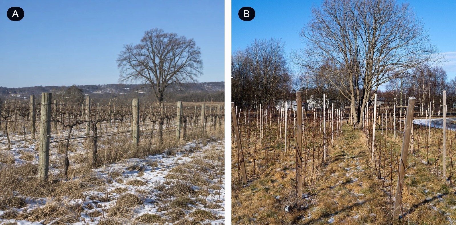
Which image is AI generated?*
For a long time you could spot an AI image by its mistakes. Six fingers, a sign full of letters that aren't really letters, a shadow going the wrong way. Cameras don't make those mistakes, so if you found one, you knew.
We wanted to see how much of that still holds for current models. We took 100 photos from Wikimedia Commons, all of different things: a street food stall, a glacier, a heron, a vineyard in winter. A vision model wrote a description of each photo, and we gave those descriptions to the ten best models on our image leaderboard. Every image, real or generated, was cropped and saved the same way, so the file itself couldn't give anything away. Then we showed people pairs: one real photo and one AI image of the same scene.
We asked two questions, each in its own run of about 55,000 votes: "which image has more glitches?" and "which image is more likely AI generated?". I assumed both would give roughly the same result.
They didn't. On glitches, the real photos did about as well as a coin flip. Against GPT Image 2.5 they did a bit worse, so people more often found the real photo the glitchier one. Looking at the images, that isn't too surprising. Real photos have noise, blur, bad light and random stuff at the edge of the frame, and the best models don't produce much of that anymore.
On the AI question it looked different. People picked the AI image about six times out of ten, and they did better than chance against all ten models, GPT Image 2.5 included.
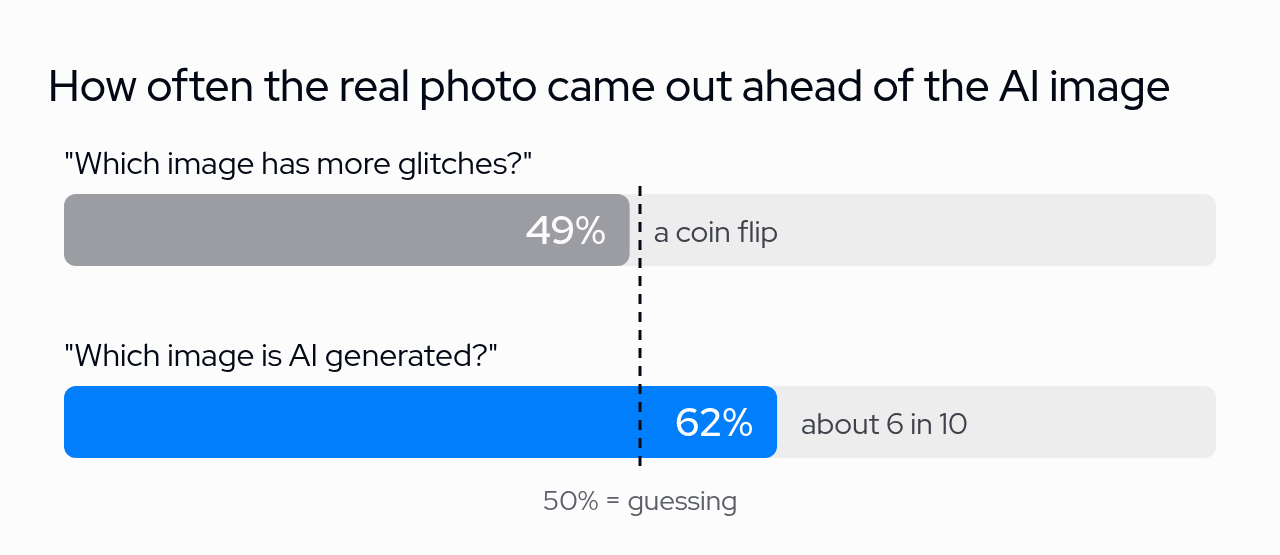
So whatever people use to tell the difference, it isn't mainly glitches. You can also see this image by image. In the chart below, each dot is one image: the further right, the fewer glitches people saw in it, and the higher up, the less AI it looked to them. The line shows what you'd expect for an AI image with a given number of glitches.
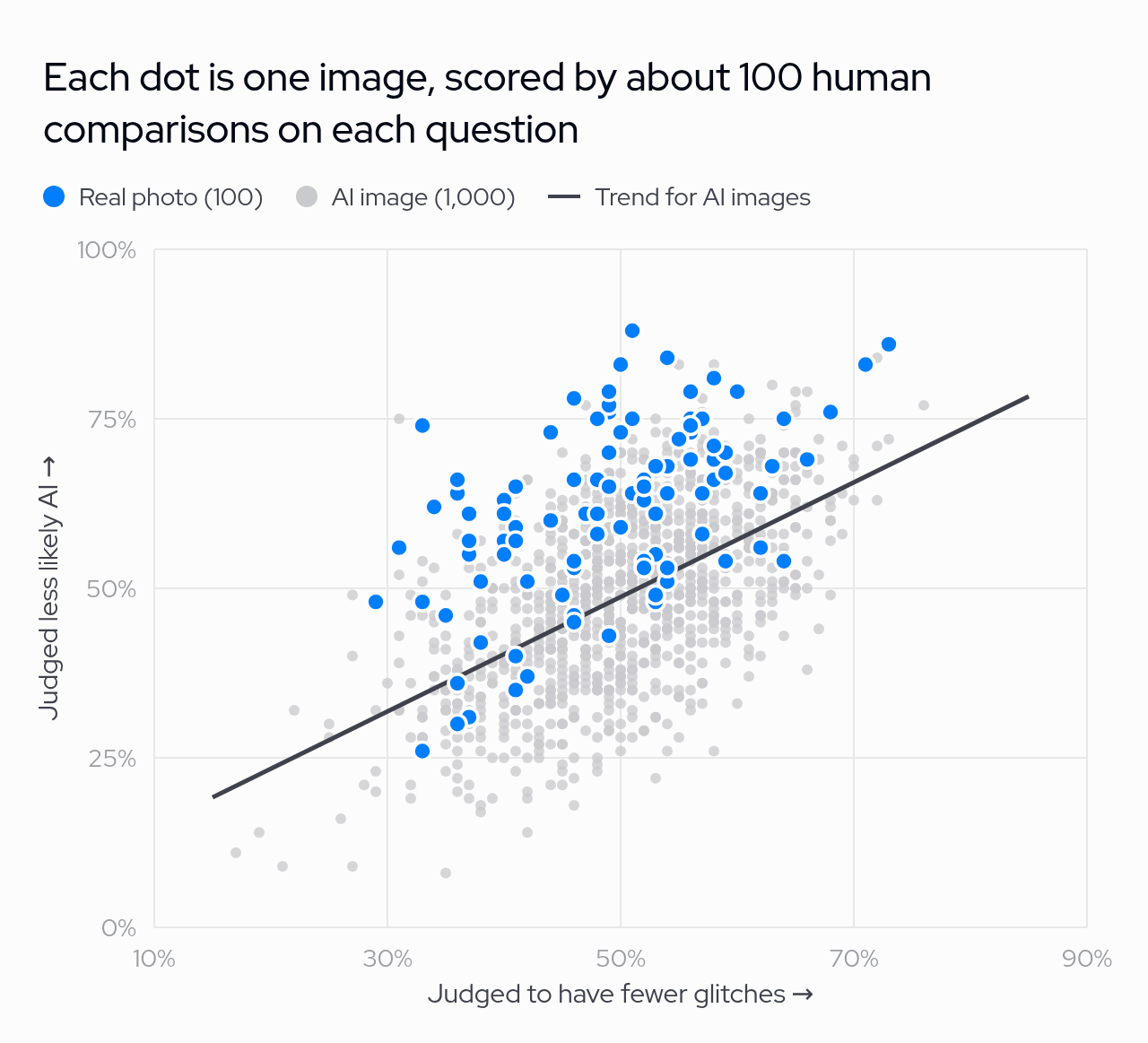
If glitches were all that mattered, the real photos (blue) would sit on that line. Most of them sit above it: a real photo looks less like AI than an AI image with just as many glitches.
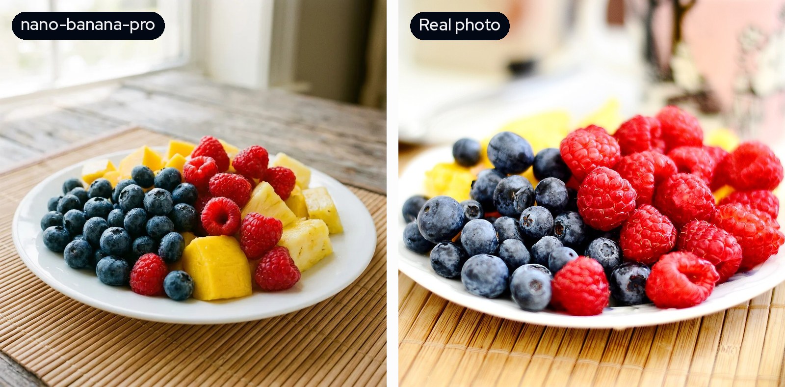
The fruit plate is a good example. In two out of three comparisons, people said the real photo (right) had more glitches. It was also judged less likely to be AI than all ten AI versions of the same scene.
What are people picking up on, then? We can't measure it directly, and I doubt most people could explain it themselves. But going through the images where the two questions disagreed most, a few things kept coming up.
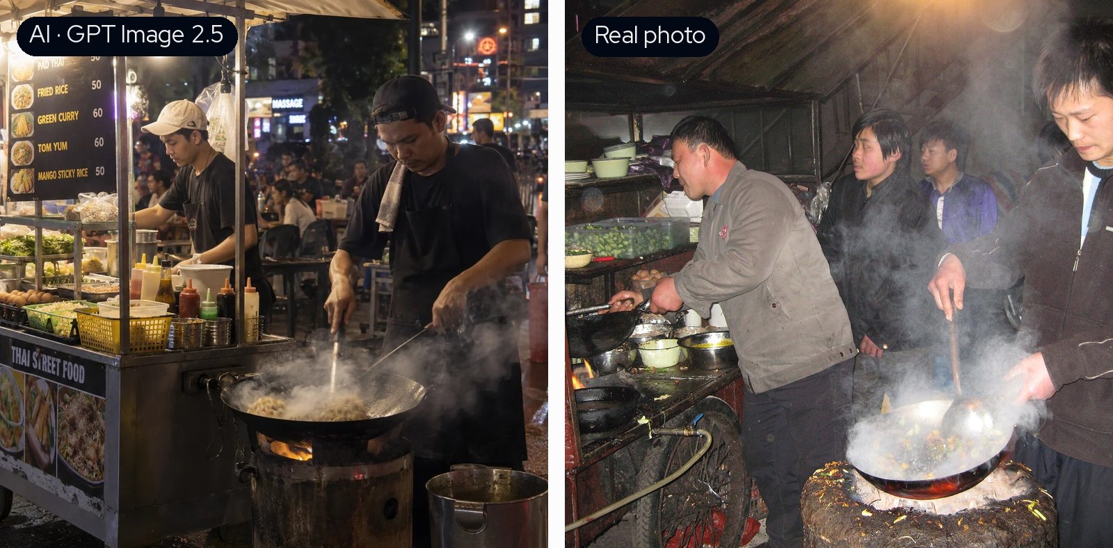
Often the AI image is just the nicer photo. In the street food example, GPT Image 2.5 made a tidy stall with a printed menu and good lighting, and people found it less glitchy than the real one. The real photo is a cramped, smoky flash shot with people crowded around the stove. People still picked it as the real one much more often.
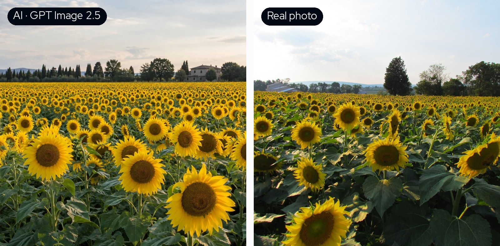
AI images also tend to be too regular. In the AI sunflower field, nearly every flower faces the camera, and they're spread evenly all the way to the horizon. In the real field they're sparser and some are turned sideways. Nothing in the AI version is wrong as such. It's just more orderly than a real field would be, and I think that's a big part of what people mean when they say an image "looks AI".
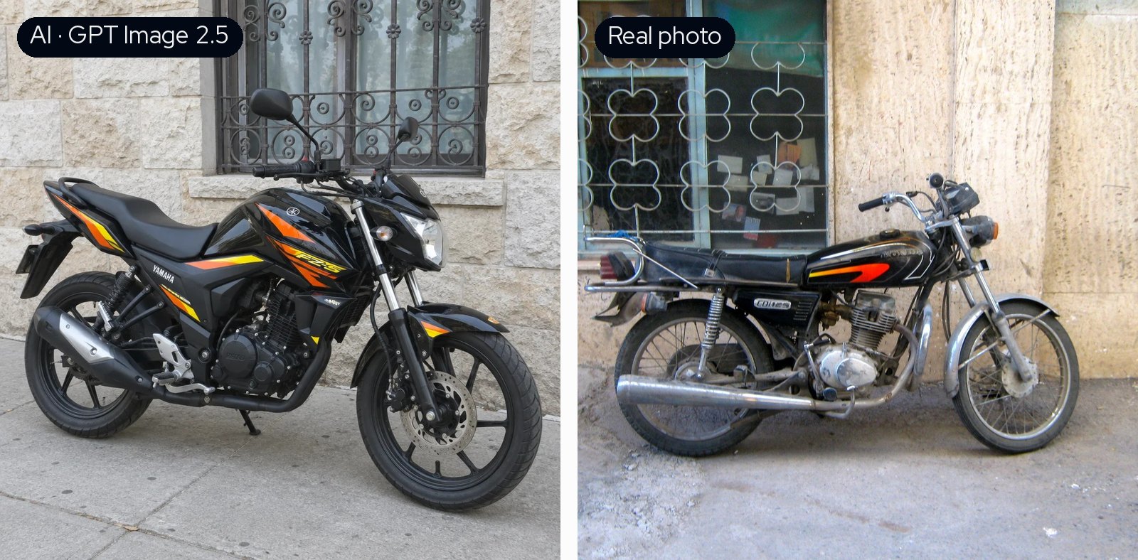
Then there's wear and color. The AI motorcycle looks new and spotless, while the real one is old, scratched and dirty. In about two out of three scenes the AI image was also more saturated than the real photo, and within a scene, the more saturated AI images were called AI more often.
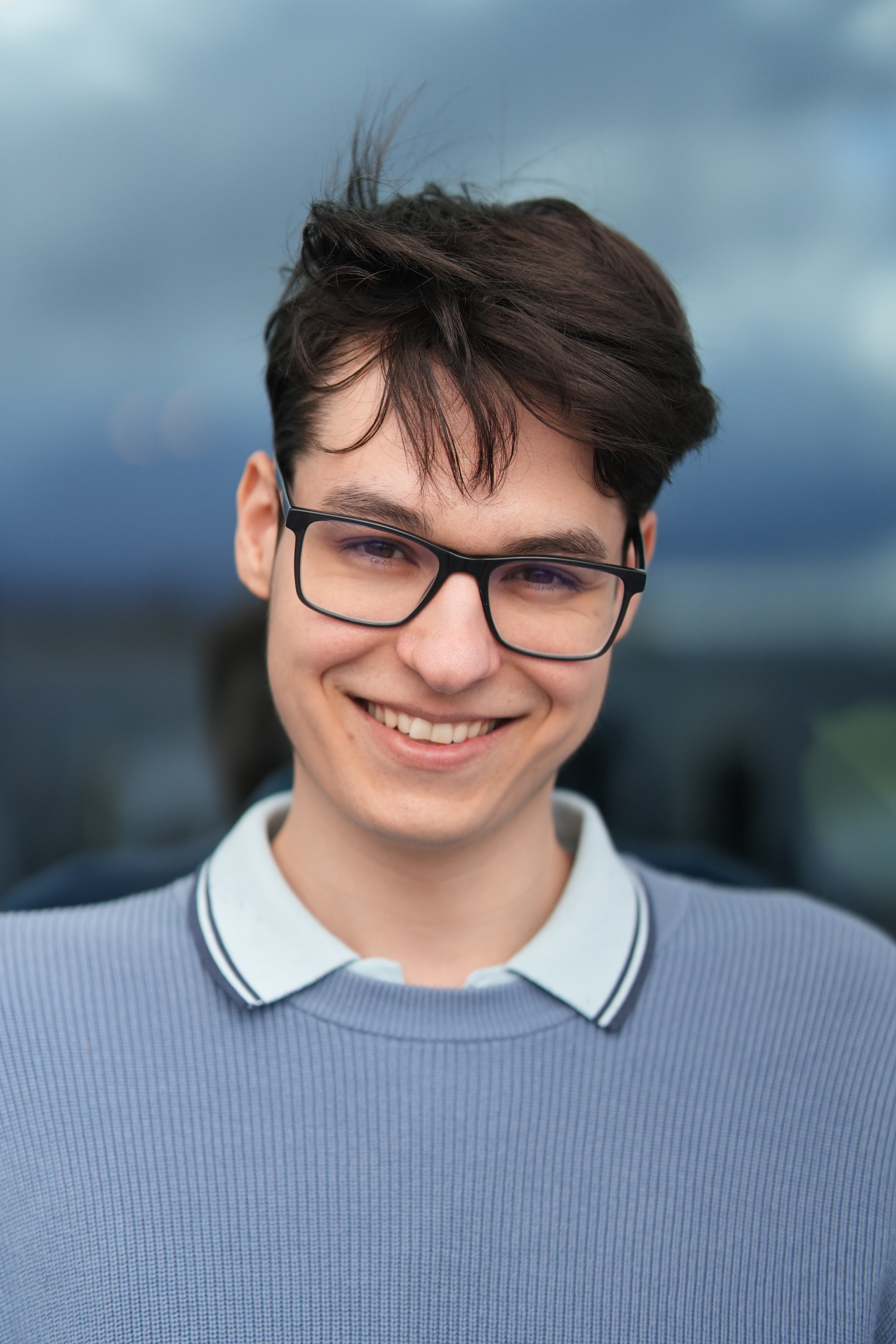
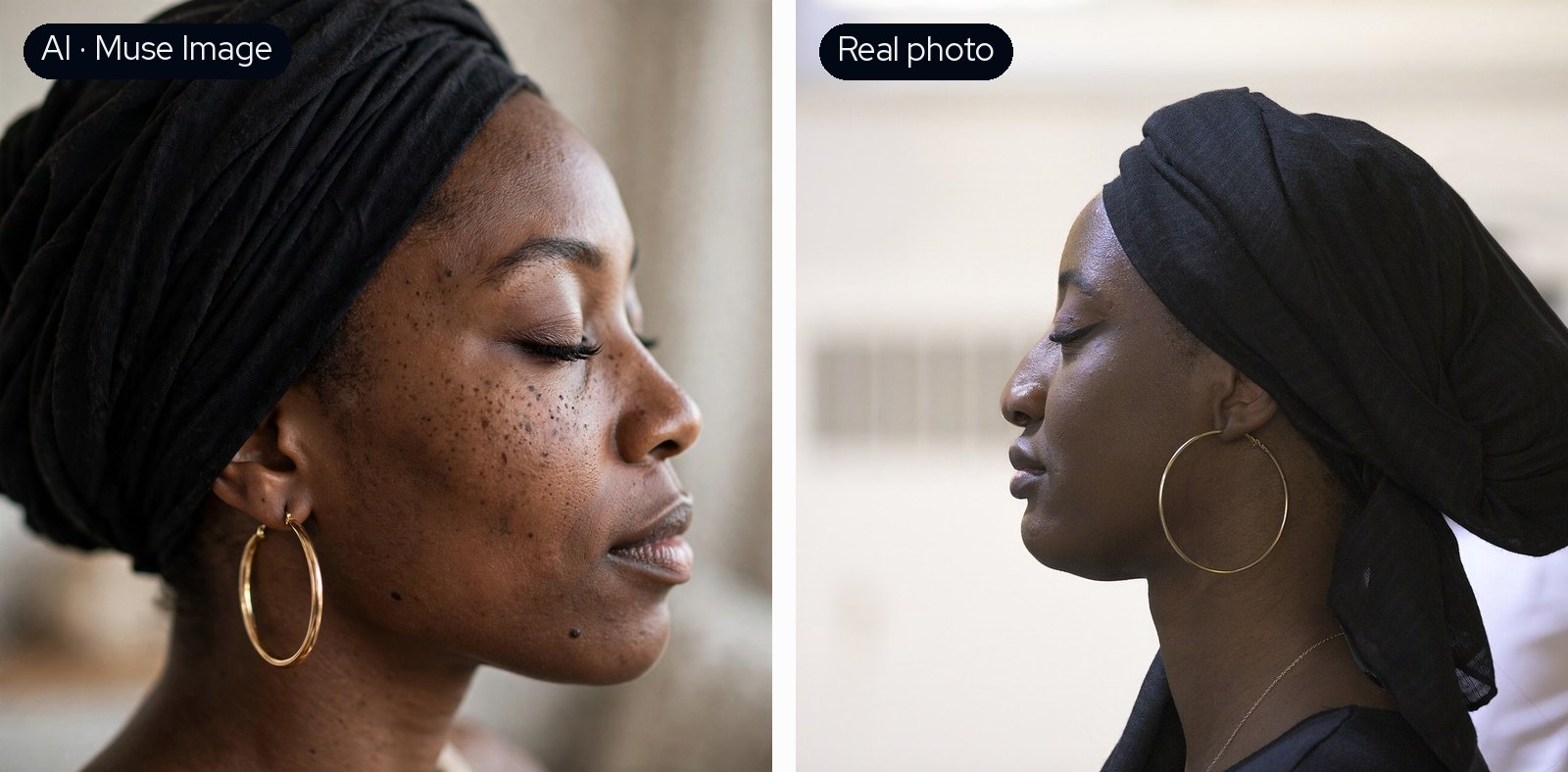
It works the other way round too. Some of the AI images that fooled people most had exactly the kind of imperfections the others were missing. This Muse portrait has freckles and visible skin texture, and people rated it less likely to be AI than the real photo.
The gap is getting small, though. Against GPT Image 2.5, people were only a little better than chance.
We also had demographics for most voters, and there was a clear age effect. People under 30 picked the AI image about two thirds of the time. After that it goes down, and people over 50 were only slightly better than guessing, at around 55%.
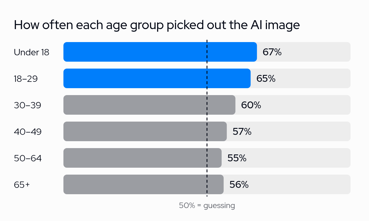
This isn't just because of where people live. The age groups aren't spread evenly across countries, but the pattern stays when you compare people from the same country. Country also had an effect of its own: people in the Philippines did best and people in Japan worst. We didn't find a difference between men and women.
If you build image models, this matters for how you evaluate them. A rater checklist or an automated detector looks for flaws, and the best models mostly don't make visible flaws anymore. What's left is harder to describe, and the only way we know to measure it is to ask a lot of people. That's what we do at Rapidata, so of course we'd say that, but the results surprised us too.
It also showed how much the setup matters. Changing a few words in the question gave a different leaderboard, and a different age group gave a different answer. If you rely on human judgments, you need control over both: the exact question, and who answers it.
Notes
* A is GPT Image 2.5 and B is the real photo. This is one of the cases where the AI won: people found it more convincing than the real photo.
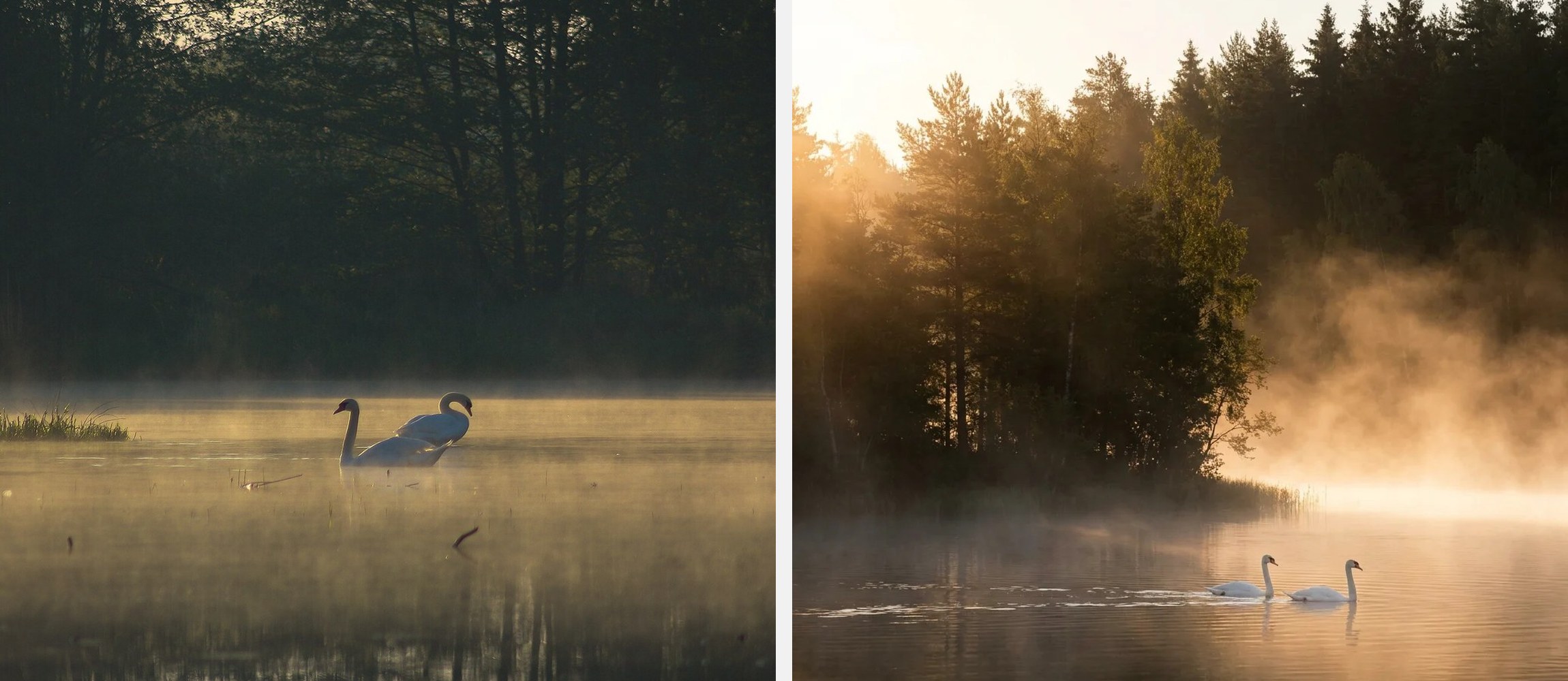
The cover image: the real photo is on the left, nano-banana-pro's version on the right.
Demographics are self-reported, and about a quarter of voters didn't give their age. The age and country differences hold after accounting for each other, for gender, and for which scene and model was shown.
Photos via Wikimedia Commons, cropped and resized: vineyard by W.carter (CC0), fruit plate by Cecilia Par (CC0), motorcycle by Sonia Sevilla (CC0), portrait by Wilfredor (CC0), street food stall by Kilroy238 (CC BY 3.0), sunflower field by Audrey from Central Pennsylvania, USA (CC BY 2.0), swans by Saschox (CC BY 4.0).


.jpg)
